Styled Mode
Choose from a variety of pre-styled themes or develop your own..
Architecture #
PrimeVue is a design agnostic library so unlike some other UI libraries it does not enforce a certain styling such as material design. Styling is decoupled from the components using the themes instead. A theme consists of two parts; base and preset. The base is the style rules with CSS variables as placeholders whereas the preset is a set of design tokens to feed a base by mapping the tokens to CSS variables. A base may be configured with different presets, currently Aura is the only preset and in upcoming version more presets will be available. Similarly, PrimeOne is the default base and a new base inspired by Material Design is coming up with a near future update.
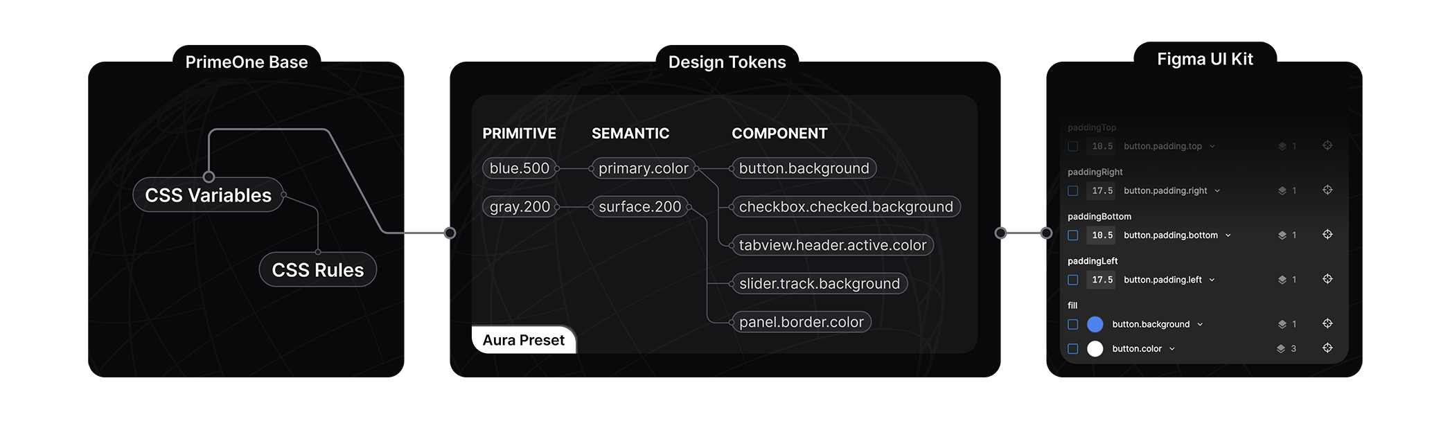
The core of the styled mode architecture is based on a concept named design token, a preset defines the token configuration in 3 tiers; primitive, semantic and component.
Primitive Tokens
Primitive tokens have no context, a color palette is a good example for a primitive token such as blue-50 to blue-900. A token named blue-500 may be used as the primary color, the background of a message however on its own, the name of the token does not indicate context. Usually they are utilized by the semantic tokens.
Semantic Tokens
Semantic tokens define content and their names indicate where they are utilized, a well known example of a semantic token is the primary.color. Semantic tokens map to primitive tokens or other semantic tokens. The colorScheme token group is a special variable to define tokens based on the color scheme active in the application, this allows defining different tokens based on the color scheme like implementing dark mode.
Component Tokens
Component tokens are isolated tokens per component such as inputtext.background or button.color that map to the semantic tokens. As an example, button.background component token maps to the primary.color semantic token which maps to the green.500 primitive token.
Best Practices
Use primitive tokens when defining the core color palette and semantic tokens to specify the common design elements such as focus ring, primary colors and surfaces. Components tokens should only be used when customizing a specific component. By defining your own design tokens as a custom preset, you'll be able to define your own style without touching CSS. Overriding the PrimeVue components using style classes is not a best practice and should be the last resort, design tokens are the suggested approach.
Configuration API #
Theme #
The theme property is used to customize the initial theme, prefer the PrimeVue plugin for custom configuration instead of the preconfigured PrimeVueStyled.
import PrimeVue from 'primevue/config';
import PrimeOne from 'primevue/themes/primeone';
import Aura from 'primevue/themes/primeone/aura';

const app = createApp(App);

app.use(PrimeVue, {
    // Default theme configuration
    theme: {
        base: PrimeOne,
        preset: Aura,
        options: {
            prefix: 'p',
            darkModeSelector: 'system',
            cssLayer: false
        }
    }
 });
Options #
The options property defines the how the CSS would be generated from the design tokens of the preset.
prefix
The prefix of the CSS variables, defaults to p. For instance, the primary.color design token would be var(--p-primary-color).
darkModeSelector
The CSS rule to encapsulate the CSS variables of the dark mode, the default is the system to generate @media (prefers-color-scheme: dark). If you need to make the dark mode toggleable based on the user selection define a class selector such as .app-dark and toggle this class at the document root. See the dark mode toggle section for an example.
cssLayer
Defines whether the styles should be defined inside a CSS layer named primevue or not. A CSS layer would be handy to declare a custom cascade layer for easier customization. The default is false. View the CSS layer section for an example usage.
Presets #
Currently Aura is the only available preset and more will follow in the upcoming updates.
import accordion from 'primevue/themes/primeone/presets/aura/accordion';
// ... imports of other component tokens

export default {
    primitive: {
        rounded: {
            sm: '4px',
            base: '6px',
            lg: '8px',
            xl: '12px'
        },
        emerald: { 50: '#ecfdf5', 100: '#d1fae5', 200: '#a7f3d0', 300: '#6ee7b7', 400: '#34d399', 500: '#10b981', 600: '#059669', 700: '#047857', 800: '#065f46', 900: '#064e3b', 950: '#022c22' },
        green: { 50: '#f0fdf4', 100: '#dcfce7', 200: '#bbf7d0', 300: '#86efac', 400: '#4ade80', 500: '#22c55e', 600: '#16a34a', 700: '#15803d', 800: '#166534', 900: '#14532d', 950: '#052e16' },
        lime: { 50: '#f7fee7', 100: '#ecfccb', 200: '#d9f99d', 300: '#bef264', 400: '#a3e635', 500: '#84cc16', 600: '#65a30d', 700: '#4d7c0f', 800: '#3f6212', 900: '#365314', 950: '#1a2e05' },
        red: { 50: '#fef2f2', 100: '#fee2e2', 200: '#fecaca', 300: '#fca5a5', 400: '#f87171', 500: '#ef4444', 600: '#dc2626', 700: '#b91c1c', 800: '#991b1b', 900: '#7f1d1d', 950: '#450a0a' },
        orange: { 50: '#fff7ed', 100: '#ffedd5', 200: '#fed7aa', 300: '#fdba74', 400: '#fb923c', 500: '#f97316', 600: '#ea580c', 700: '#c2410c', 800: '#9a3412', 900: '#7c2d12', 950: '#431407' },
        amber: { 50: '#fffbeb', 100: '#fef3c7', 200: '#fde68a', 300: '#fcd34d', 400: '#fbbf24', 500: '#f59e0b', 600: '#d97706', 700: '#b45309', 800: '#92400e', 900: '#78350f', 950: '#451a03' },
        yellow: { 50: '#fefce8', 100: '#fef9c3', 200: '#fef08a', 300: '#fde047', 400: '#facc15', 500: '#eab308', 600: '#ca8a04', 700: '#a16207', 800: '#854d0e', 900: '#713f12', 950: '#422006' },
        teal: { 50: '#f0fdfa', 100: '#ccfbf1', 200: '#99f6e4', 300: '#5eead4', 400: '#2dd4bf', 500: '#14b8a6', 600: '#0d9488', 700: '#0f766e', 800: '#115e59', 900: '#134e4a', 950: '#042f2e' },
        cyan: { 50: '#ecfeff', 100: '#cffafe', 200: '#a5f3fc', 300: '#67e8f9', 400: '#22d3ee', 500: '#06b6d4', 600: '#0891b2', 700: '#0e7490', 800: '#155e75', 900: '#164e63', 950: '#083344' },
        sky: { 50: '#f0f9ff', 100: '#e0f2fe', 200: '#bae6fd', 300: '#7dd3fc', 400: '#38bdf8', 500: '#0ea5e9', 600: '#0284c7', 700: '#0369a1', 800: '#075985', 900: '#0c4a6e', 950: '#082f49' },
        blue: { 50: '#eff6ff', 100: '#dbeafe', 200: '#bfdbfe', 300: '#93c5fd', 400: '#60a5fa', 500: '#3b82f6', 600: '#2563eb', 700: '#1d4ed8', 800: '#1e40af', 900: '#1e3a8a', 950: '#172554' },
        indigo: { 50: '#eef2ff', 100: '#e0e7ff', 200: '#c7d2fe', 300: '#a5b4fc', 400: '#818cf8', 500: '#6366f1', 600: '#4f46e5', 700: '#4338ca', 800: '#3730a3', 900: '#312e81', 950: '#1e1b4b' },
        violet: { 50: '#f5f3ff', 100: '#ede9fe', 200: '#ddd6fe', 300: '#c4b5fd', 400: '#a78bfa', 500: '#8b5cf6', 600: '#7c3aed', 700: '#6d28d9', 800: '#5b21b6', 900: '#4c1d95', 950: '#2e1065' },
        purple: { 50: '#faf5ff', 100: '#f3e8ff', 200: '#e9d5ff', 300: '#d8b4fe', 400: '#c084fc', 500: '#a855f7', 600: '#9333ea', 700: '#7e22ce', 800: '#6b21a8', 900: '#581c87', 950: '#3b0764' },
        fuchsia: { 50: '#fdf4ff', 100: '#fae8ff', 200: '#f5d0fe', 300: '#f0abfc', 400: '#e879f9', 500: '#d946ef', 600: '#c026d3', 700: '#a21caf', 800: '#86198f', 900: '#701a75', 950: '#4a044e' },
        pink: { 50: '#fdf2f8', 100: '#fce7f3', 200: '#fbcfe8', 300: '#f9a8d4', 400: '#f472b6', 500: '#ec4899', 600: '#db2777', 700: '#be185d', 800: '#9d174d', 900: '#831843', 950: '#500724' },
        rose: { 50: '#fff1f2', 100: '#ffe4e6', 200: '#fecdd3', 300: '#fda4af', 400: '#fb7185', 500: '#f43f5e', 600: '#e11d48', 700: '#be123c', 800: '#9f1239', 900: '#881337', 950: '#4c0519' },
        slate: { 50: '#f8fafc', 100: '#f1f5f9', 200: '#e2e8f0', 300: '#cbd5e1', 400: '#94a3b8', 500: '#64748b', 600: '#475569', 700: '#334155', 800: '#1e293b', 900: '#0f172a', 950: '#020617' },
        gray: { 50: '#f9fafb', 100: '#f3f4f6', 200: '#e5e7eb', 300: '#d1d5db', 400: '#9ca3af', 500: '#6b7280', 600: '#4b5563', 700: '#374151', 800: '#1f2937', 900: '#111827', 950: '#030712' },
        zinc: { 50: '#fafafa', 100: '#f4f4f5', 200: '#e4e4e7', 300: '#d4d4d8', 400: '#a1a1aa', 500: '#71717a', 600: '#52525b', 700: '#3f3f46', 800: '#27272a', 900: '#18181b', 950: '#09090b' },
        neutral: { 50: '#fafafa', 100: '#f5f5f5', 200: '#e5e5e5', 300: '#d4d4d4', 400: '#a3a3a3', 500: '#737373', 600: '#525252', 700: '#404040', 800: '#262626', 900: '#171717', 950: '#0a0a0a' },
        stone: { 50: '#fafaf9', 100: '#f5f5f4', 200: '#e7e5e4', 300: '#d6d3d1', 400: '#a8a29e', 500: '#78716c', 600: '#57534e', 700: '#44403c', 800: '#292524', 900: '#1c1917', 950: '#0c0a09' }
    },
    semantic: {
        transitionDuration: '0.2s',
        focusRing: {
            width: '1px',
            style: 'solid',
            color: '{primary.500}',
            offset: '2px'
        },
        anchorGutter: '2px',
        primary: {
            50: '{emerald.50}',
            100: '{emerald.100}',
            200: '{emerald.200}',
            300: '{emerald.300}',
            400: '{emerald.400}',
            500: '{emerald.500}',
            600: '{emerald.600}',
            700: '{emerald.700}',
            800: '{emerald.800}',
            900: '{emerald.900}',
            950: '{emerald.950}'
        },
        colorScheme: {
            light: {
                surface: {
                    0: '#ffffff',
                    50: '{slate.50}',
                    100: '{slate.100}',
                    200: '{slate.200}',
                    300: '{slate.300}',
                    400: '{slate.400}',
                    500: '{slate.500}',
                    600: '{slate.600}',
                    700: '{slate.700}',
                    800: '{slate.800}',
                    900: '{slate.900}',
                    950: '{slate.950}'
                },
                primary: {
                    color: '{primary.500}',
                    inverseColor: '#ffffff',
                    hoverColor: '{primary.600}',
                    activeColor: '{primary.700}'
                },
                highlight: {
                    background: '{primary.50}',
                    focusBackground: '{primary.100}',
                    color: '{primary.700}',
                    focusColor: '{primary.800}'
                },
                maskBackground: 'rgba(0,0,0,0.4)',
                formField: {
                    background: '{surface.0}',
                    disabledBackground: '{surface.200}',
                    filledBackground: '{surface.50}',
                    filledFocusBackground: '{surface.0}',
                    borderColor: '{surface.300}',
                    hoverBorderColor: '{surface.400}',
                    focusBorderColor: '{primary.color}',
                    invalidBorderColor: '{red.400}',
                    color: '{surface.700}',
                    disabledColor: '{surface.500}',
                    placeholderColor: '{surface.500}',
                    floatLabelColor: '{surface.500}',
                    floatLabelFocusColor: '{surface.500}',
                    floatLabelInvalidColor: '{red.400}',
                    boxShadow: '0 0 #0000, 0 0 #0000, 0 1px 2px 0 rgba(18, 18, 23, 0.05)'
                }
            },
            dark: {
                surface: {
                    0: '#ffffff',
                    50: '{zinc.50}',
                    100: '{zinc.100}',
                    200: '{zinc.200}',
                    300: '{zinc.300}',
                    400: '{zinc.400}',
                    500: '{zinc.500}',
                    600: '{zinc.600}',
                    700: '{zinc.700}',
                    800: '{zinc.800}',
                    900: '{zinc.900}',
                    950: '{zinc.950}'
                },
                primary: {
                    color: '{primary.400}',
                    inverseColor: '{surface.900}',
                    hoverColor: '{primary.300}',
                    activeColor: '{primary.200}'
                },
                highlight: {
                    background: 'color-mix(in srgb, {primary.400}, transparent 84%)',
                    focusBackground: 'color-mix(in srgb, {primary.400}, transparent 76%)',
                    color: 'rgba(255,255,255,.87)',
                    focusColor: 'rgba(255,255,255,.87)'
                },
                maskBackground: 'rgba(0,0,0,0.4)',
                formField: {
                    background: '{surface.950}',
                    disabledBackground: '{surface.700}',
                    filledBackground: '{surface.800}',
                    filledFocusBackground: '{surface.950}',
                    borderColor: '{surface.700}',
                    hoverBorderColor: '{surface.600}',
                    focusBorderColor: '{primary.color}',
                    invalidBorderColor: '{red.300}',
                    color: '{surface.0}',
                    disabledColor: '{surface.400}',
                    placeholderColor: '{surface.400}',
                    floatLabelColor: '{surface.400}',
                    floatLabelFocusColor: '{surface.400}',
                    floatLabelInvalidColor: '{red.300}',
                    boxShadow: '0 0 #0000, 0 0 #0000, 0 1px 2px 0 rgba(18, 18, 23, 0.05)'
                }
            }
        }
    },
    components: {
        accordion,
        // ... other components
    }
};
Case Style #
Tokens are described with the dot separator e.g. primary.color, form.field.background or checkbox.icon.checked.color. At preset configuration, camel case and object property are used when mapping the dot separator. The following is an example from the checkbox component tokens to represent the checkbox.icon.checked.color, all alternatives have the same result.
export default {
    iconCheckedColor: //...,
}

export default {
    icon: {
        checkedColor: //...
    }
}

export default {
    icon: {
        checked: {
            color: //...
        }
    }
}
Reserved Keys #
Following keys are reserved in the preset scheme and cannot be used as a token name; primitive, semantic, components, directives, colorscheme, light, dark, common, root, states.
Customization #
definePreset #
The definePreset utility is used to customize an existing preset during the PrimeVue setup. The first parameter is the preset to customize and the second is the design tokens to override.
import PrimeVue from 'primevue/config';
import { definePreset } from 'primevue/themes';
import PrimeOne from 'primevue/themes/primeone';
import Aura from 'primevue/themes/primeone/aura';

const MyPreset = definePreset(Aura, {
    //Your customizations, see the following sections for examples
});

app.use(PrimeVue, {
    theme: {
        base: PrimeOne,
        preset: MyPreset
    }
 });
Primary #
The primary defines the main color palette, default value maps to the emerald primitive token. Let's setup to use indigo instead.
const MyPreset = definePreset(Aura, {
    semantic: {
        primary: {
            50: '{indigo.50}',
            100: '{indigo.100}',
            200: '{indigo.200}',
            300: '{indigo.300}',
            400: '{indigo.400}',
            500: '{indigo.500}',
            600: '{indigo.600}',
            700: '{indigo.700}',
            800: '{indigo.800}',
            900: '{indigo.900}',
            950: '{indigo.950}'
        }
    }
});
Noir #
The noir mode is the nickname of a variant that uses black tones as the primary and requires and additional colorScheme configuration to implement. A sample preset configuration with black and white variants as the primary color;
const Noir = definePreset(Aura, {
    semantic: {
        primary: {
            50: '{zinc.50}',
            100: '{zinc.100}',
            200: '{zinc.200}',
            300: '{zinc.300}',
            400: '{zinc.400}',
            500: '{zinc.500}',
            600: '{zinc.600}',
            700: '{zinc.700}',
            800: '{zinc.800}',
            900: '{zinc.900}',
            950: '{zinc.950}'
        },
        colorScheme: {
            light: {
                primary: {
                    color: '{zinc.950}',
                    inverseColor: '#ffffff',
                    hoverColor: '{zinc.900}',
                    activeColor: '{zinc.800}'
                },
                highlight: {
                    background: '{zinc.950}',
                    focusBackground: '{zinc.700}',
                    color: '#ffffff',
                    focusColor: '#ffffff'
                }
            },
            dark: {
                primary: {
                    color: '{zinc.50}',
                    inverseColor: '{zinc.950}',
                    hoverColor: '{zinc.100}',
                    activeColor: '{zinc.200}'
                },
                highlight: {
                    background: 'rgba(250, 250, 250, .16)',
                    focusBackground: 'rgba(250, 250, 250, .24)',
                    color: 'rgba(255,255,255,.87)',
                    focusColor: 'rgba(255,255,255,.87)'
                }
            }
        }
    }
});
Surface #
The color scheme palette that varies between light and dark modes is specified with the surface tokens. Example below uses zinc for light mode and slategray for dark mode. With this setting, light mode, would have a grayscale tone and dark mode would include blue tone.
const MyPreset = definePreset(Aura, {
    semantic: {
        colorScheme: {
            light: {
                surface: {
                    0: '#ffffff',
                    50: '{zinc.50}',
                    100: '{zinc.100}',
                    200: '{zinc.200}',
                    300: '{zinc.300}',
                    400: '{zinc.400}',
                    500: '{zinc.500}',
                    600: '{zinc.600}',
                    700: '{zinc.700}',
                    800: '{zinc.800}',
                    900: '{zinc.900}',
                    950: '{zinc.950}'
                }
            },
            dark: {
                surface: {
                    0: '#ffffff',
                    50: '{slate.50}',
                    100: '{slate.100}',
                    200: '{slate.200}',
                    300: '{slate.300}',
                    400: '{slate.400}',
                    500: '{slate.500}',
                    600: '{slate.600}',
                    700: '{slate.700}',
                    800: '{slate.800}',
                    900: '{slate.900}',
                    950: '{slate.950}'
                }
            }
        }
    }
});
Font #
There is no design for fonts as UI components inherit their font settings from the application.
Forms #
The design tokens of the form input components are derived from the form.field token group. This customization example changes border color to primary on hover. Any component that depends on this semantic token such as dropdown.hover.border.color and textarea.hover.border.color would receive the change.
const MyPreset = definePreset(Aura, {
    semantic: {
        colorScheme: {
            light: {
                formField: {
                    hoverBorderColor: '{primary.color}'
                }
            },
            dark: {
                formField: {
                    hoverBorderColor: '{primary.color}'
                }
            }
        }
    }
});
Focus Ring #
Focus ring defines the outline width, style, color and offset. Let's use a thicker ring with the primary color for the outline.
const MyPreset = definePreset(Aura, {
    semantic: {
        focusRing: {
            width: '2px',
            style: 'dashed',
            color: '{primary.color}',
            offset: '1px'
        }
    }
});
Component #
The design tokens of a specific component is defined at components layer. Overriding components tokens is not the recommended approach if you are building our own style, building your own preset should be preferred instead. This configuration is global and applies to all card components, in case you need to customize a particular component on a page locally, view the Scoped CSS section for an example.
const MyPreset = definePreset(Aura, {
    components: {
        card: {
            colorScheme: {
                light: {
                    root: {
                        background: '{surface.0}',
                        color: '{surface.700}'
                    },
                    subtitle: {
                        color: '{surface.500}'
                    }
                },
                dark: {
                    root: {
                        background: '{surface.900}',
                        color: '{surface.0}'
                    },
                    subtitle: {
                        color: '{surface.400}'
                    }
                }
            }
        }
    }
});
Scoped Tokens #
Design tokens can be scoped to a certain component using CSS variables. In this example, first switch uses the global tokens whereas second one overrides the global with its own tokens.
<template>
    <div>
        <InputSwitch v-model="checked1" />
        <InputSwitch v-model="checked2" :dt="amberSwitch" />
    </div>
</template>

<script setup>
import { ref } from 'vue';

const checked1 = ref(true);
const checked2 = ref(true);
const amberSwitch = ref({
    handle: {
        borderRadius: '4px'
    },
    colorScheme: {
        light: {
            root: {
                checkedBackground: '{amber.500}',
                checkedHoverBackground: '{amber.600}',
                borderRadius: '4px'
            },
            handle: {
                checkedBackground: '{amber.50}',
                checkedHoverBackground: '{amber.100}'
            }
        },
        dark: {
            root: {
                checkedBackground: '{amber.400}',
                checkedHoverBackground: '{amber.300}',
                borderRadius: '4px'
            },
            handle: {
                checkedBackground: '{amber.900}',
                checkedHoverBackground: '{amber.800}'
            }
        }
    }
});
</script>
Utils #
usePreset #
Replaces the current presets entirely, common use case is changing the preset dynamically at runtime.
import { usePreset } from 'primevue/themes';

const onButtonClick() {
    usePreset(MyPreset);
}
updatePreset #
Merges the provided tokens to the current preset, an example would be changing the primary color palette dynamically.
import { updatePreset } from 'primevue/themes';

const changePrimaryColor() {
    updatePreset({
        semantic: {
            primary: {
                50: '{indigo.50}',
                100: '{indigo.100}',
                200: '{indigo.200}',
                300: '{indigo.300}',
                400: '{indigo.400}',
                500: '{indigo.500}',
                600: '{indigo.600}',
                700: '{indigo.700}',
                800: '{indigo.800}',
                900: '{indigo.900}',
                950: '{indigo.950}'
            }
        }
    })
}
updatePrimaryPalette #
Updates the primary colors, this is a shorthand to do the same update using updatePreset.
import { updatePrimaryPalette } from 'primevue/themes';

const changePrimaryColor() {
    updatePrimaryPalette({
        50: '{indigo.50}',
        100: '{indigo.100}',
        200: '{indigo.200}',
        300: '{indigo.300}',
        400: '{indigo.400}',
        500: '{indigo.500}',
        600: '{indigo.600}',
        700: '{indigo.700}',
        800: '{indigo.800}',
        900: '{indigo.900}',
        950: '{indigo.950}'
    });
}
updateSurfacePalette #
Updates the surface colors, this is a shorthand to do the same update using updatePreset.
import { updateSurfacePalette } from 'primevue/themes';

const changeSurfaces() {
    //changes surfaces both in light and dark mode
    updateSurfacePalette({
        50: '{zinc.50}',
        // ...
        950: '{zinc.950}'
    });
}

const changeLightSurfaces() {
    //changes surfaces only in light
    updateSurfacePalette({
        light: {
            50: '{zinc.50}',
            // ...
            950: '{zinc.950}'
        }
    });
}

const changeDarkSurfaces() {
    //changes surfaces only in dark mode
    updateSurfacePalette({
        dark: {
            50: '{zinc.50}',
            // ...
            950: '{zinc.950}'
        }
    });
}
useTheme #
Replaces the theme including the base and the preset such as from PrimeOne to Material. Note that the built-in Material theme is under development.
import { useTheme } from 'primevue/themes';

const changeTheme() {
    useTheme({
        base: MaterialDesign,
        preset: M3
    });
}
$dt #
The $dt function returns the information about a token like the full path and value. This would be useful if you need to access tokens programmatically.
import { $dt } from 'primevue/themes';

const duration = $dt('transition.duration');
/*
  duration: {
    name: '--transition-duration',
    variable: 'var(--p-transition-duration)',
    value: '0.2s'
  }
*/

const primaryColor = $dt('primary.color');
/*
  primaryColor: {
    name: '--primary-color',
    variable: 'var(--p-primary-color)',
    value: {
      light: {
        value: '#10b981',
        path: {
            name: 'semantic.primary.color',
            binding: {
                name: 'primitive.emerald.500'
            }
        }
      },
      dark: {
        value: '#34d399',
        path: {
            name: 'semantic.primary.color',
            binding: {
                name: 'primitive.emerald.400'
            }
        }
      }
    }
  }
*/
palette #
Returns shades and tints of a given color from 50 to 950 as an array.
import { palette } from 'primevue/themes';

// custom color
const values1 = palette('#10b981');

// copy an existing token set
const primaryColor = palette('{blue}');
Colors #
Color palette of a preset is defined by the primitive design token group. The default colors are derived from the Tailwind colors with some extensions to make it consistent with the Tailwind Presets projects of the unstyled mode.
Colors can be accessed at CSS as a variable and programmatically using the $dt utility.
// With CSS
var(--p-blue-500)

// With JS
$dt('blue.500', 'value')
- emerald50100200300400500600700800900950
- green50100200300400500600700800900950
- lime50100200300400500600700800900950
- red50100200300400500600700800900950
- orange50100200300400500600700800900950
- amber50100200300400500600700800900950
- yellow50100200300400500600700800900950
- teal50100200300400500600700800900950
- cyan50100200300400500600700800900950
- sky50100200300400500600700800900950
- blue50100200300400500600700800900950
- indigo50100200300400500600700800900950
- violet50100200300400500600700800900950
- purple50100200300400500600700800900950
- fuchsia50100200300400500600700800900950
- pink50100200300400500600700800900950
- rose50100200300400500600700800900950
- slate50100200300400500600700800900950
- gray50100200300400500600700800900950
- zinc50100200300400500600700800900950
- neutral50100200300400500600700800900950
- stone50100200300400500600700800900950
Dark Mode Toggle #
PrimeVue uses the system as the default darkModeSelector in theme configuration. If you have a dark mode switch in your application, set the darkModeSelector to the selector you utilize such as .my-app-dark so that PrimeVue can fit in seamlessly with your light-dark toggle.
import PrimeVue from 'primevue/config';
import PrimeOne from 'primevue/themes/primeone';
import Aura from 'primevue/themes/primeone/aura';

const app = createApp(App);

app.use(PrimeVue, {
    // Default theme configuration
    theme: {
        base: PrimeOne,
        preset: Aura,
        options: {
            darkModeSelector: 'my-app-dark',
        }
    }
 });
An example implementation of a dark mode switch, you may extend it further by involving prefers-color-scheme to keep it from the system initially and localStorage to make it stateful. See this article for more information.
<Button label="Toggle Color Scheme" @click="toggleColorScheme()" />
const toggleColorScheme() {
    document.body.classList.toggle("my-app-dark");
}
CSS Layer #
The PrimeVue CSS layer only applies to styled mode when layering is enabled explicitly at theme configuration, in unstyled mode the built-in CSS classes are not included and as a result no layer is necessary.
Specificity #
The @layer is a standard CSS feature to define cascade layers for a customizable order of precedence. If you need to become more familiar with layers, visit the documentation at MDN to begin with. In styled mode, when the cssLayer option is enabled at theme configuration, PrimeVue wraps the built-in style classes under the primevue cascade layer to make the library styles easy to override. CSS in your app without a layer has the highest CSS specificity, so you'll be able to override styles regardless of the location or how strong a class is written. The cssLayer is disabled by default to avoid compatibility issues with 3rd party CSS libraries which requires a layer configuration for compatibility that is discussed in the next reset section.
For example, let's assume you need to remove the rounded borders of the InputSwitch component defined by the theme in use. In order to achieve this, .p-inputswitch .p-inputswitch-slider selector needs to be overriden. Without the layers, we'd have to write a stronger css or use !important however, with layers, this does not present an issue as your CSS can always override PrimeVue with a more straightforward class name such as my-switch-slider. Another advantage of this approach is that it does not force you to figure out the built-in class names of the components.
<template>
    <InputSwitch v-model="checked" :pt="{ slider: 'my-switch-slider' }" />
</template>

<script>
import { ref } from "vue";

const checked = ref(false);
</script>

<style>
.my-switch-slider {
    border-radius: 0;
}

.my-switch-slider:before {
    border-radius: 0;
}
</style>
Layers also make it easier to use CSS Modules, view the CSS Modules guide for examples.
Reset #
Ease of customization may present an issue if you have global styles on HTML elements like inputs and buttons that are also utilized by PrimeVue because global styles with a broader scope e.g. button { } and no layer always override the PrimeVue components leading to unexpected results. A common use case for global styles applying to standard HTML elements is CSS reset utilities to remove the default styling of the browsers. In this case, best practice is wrapping your CSS in a layer like reset and make sure primevue comes after your layer since layers defined after has higher precedence. This way, your Reset CSS does not get in the way of PrimeVue components.
/* Order */
@layer reset, primevue;

/* Reset CSS */
@layer reset {
    button,
    input {
        /* CSS to Reset */
    }
}
If you are using Nuxt, use the built-in cssLayerOrder property of the PrimeVue nuxt module instead.
Libraries #
Example layer configuration for the popular CSS libraries.
Bootstrap
Bootstrap has a reboot utility to reset the CSS of the standard elements. If you are including this utility, you may give it a layer while importing it.
@layer bootstrap-reboot, primevue;

@import "bootstrap-reboot.css" layer(bootstrap-rebooot);
Tailwind
Tailwind CSS includes a reset utility in base called preflight. If you are using this feature, wrap the base and utilities in separate layers and make sure primevue layer comes after the base.
@layer tailwind-base, primevue, tailwind-utilities;

@layer tailwind-base {
    @tailwind base;
}

@layer tailwind-utilities {
    @tailwind components;
    @tailwind utilities;
}
Normalize
Normalize is another utility to reset CSS of the standard elements. While importing the CSS file, assign it to a layer and define the layer order with primevue coming after the normalized layer.
@layer normalize, primevue;

@import "normalize.css" layer(normalize-reset);
CSS Modules #
CSS modules are supported by enabling the module property on a style element within your SFC. Use the $style keyword to apply classes to a PrimeVue component. It is recommend to enable cssLayer when using CSS modules so that the PrimeVue styles have low CSS specificity.
<style module>
.myinput {
    border-radius: 2rem;
    padding: 1rem 2rem;
    border-width: 2px;
}
</style>
<template>
    <InputText :class="$style.myinput" placeholder="Search" />
</template>
Scale #
PrimeVue UI component use rem units, 1rem equals to the font size of the html element which is 16px by default. Use the root font-size to adjust the size of the components globally. This website uses 14px as the base so it may differ from your application if your base font size is different.
html {
    font-size: 14px;
}